
")
")
I hope that you all took the time to read my blog from yesterday. It was a little scary to finally put into words my heart for my business and the new direction I am taking. In case you missed it, click here and you can read yesterday’s post.
Today I want share more about printing your photos and why having a professional print your photos is so important. Last summer I had a client call me because she had printed photos from their family session and they turned out REALLY pink. I asked her where she had them printed and she said “Walgreens”. I told her that all of those bargain printers are different (and can even differ from month to month as the colors start to run out in the printers) and they can really change the look of the pictures. I know we all want to save a little money (and time if you are in a hurry to get photos before a project or before company comes to town) but why spend so much money to have photos taken and then go super cheap on the actual physical product that you hang in your home?
In order to help show you my point I did a little experiment last week. I had photos printed from SIX different places so I could compare them. It was funny that each time I picked up the photos I thought…man these are pretty good….maybe professional prints aren’t that different. Until I got home and compared them. I tried to pick photos that had good coloring to them and that would be easy to compare.
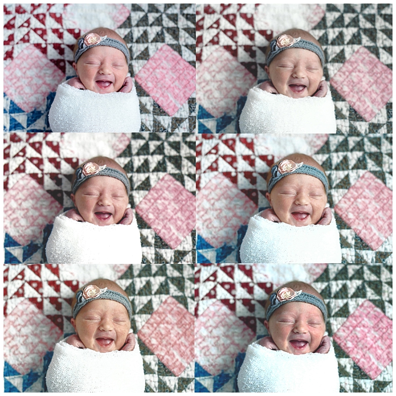
Here comes the hard part. How do I correctly show you how these photos compare? I tried to scan them all in and compare them that way….but my scanner isn’t that great and here is what happened.
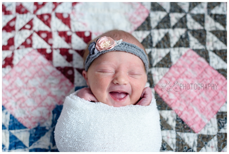
Here is the original photo of sweet little Carolyn.
Now here are the scans. I put them all together in Photoshop so you can see the comparison but the scanner took a lot of color out of them. The professional photo (the one on the top right side is just about a PERFECT match for the digital version (on the top left side) in REAL LIFE. However, you can still see that the texture is similar in the original digital and the professional one. The middle left is Costco, the middle right is from CVS, the bottom left is Target (it is the worst one in real life) and the bottom right is Walgreens. The Walmart one didn’t make the cut into this collage but it and Costco are a tie for my favorites from this bunch. See how much variance there is between these photos (even though the scanner quality is terrible).
After the scanner proved to be less than adequate, I decided to do it the old fashioned way with paper and glue. I took the photos and glued them to poster board. It was all fine and dandy until it came time to digitally put them into a blog for you! I had to take a picture of the picture. It kind of reminded me of the 90’s move Multiplicity with Micheal Keaton. I LOVE that movie! Anyway, he doesn’t have enough time so he clones himself and then later clones himself again so he has a “work clone” a “home clone” and then he can have time for himself. Eventually the clones decide to experiment and they make a clone of the clone. “You made a copy of the copy!!!!!????”. The clone clone is hilarious and calls everyone Steve. I digress. If you haven’t seen that movie, it is worth the watch.
Here is the digital (original) version of beautiful Katie.
Here are the 6 different printed photographs. The Professional lab print is the top left, Costco top right, CVS middle left, Target middle right, Walgreens bottom left and Walmart bottom right (I am a type A personality so they are all in alphabetical order. It made my life easier when I was gluing them down).
It is hard to tell from this copy of the copy but the top left (professional) is almost a 100% match. You can see how different the blue/turquoise wall looks in the other 5 photos. Also look at the skin tone! The coloring from Walgreens is very similar but her eyes are REALLY dark so you can’t see the beautiful sparkle in them. The Target one is terrible and her skin looks really orange and her hair is washed out. The Costco one (top right) her face is really pink but the rest of the photo is pretty good. The Walmart (bottom right) is the good but it is a little more green than blue. Crazy how the same photo looks so different when printed, right?
Here is the next one. Sweet Lucia.

Then here are the printed photos.
Again…it is hard to tell but the top left is the professional one and it is pretty darn close to the original. Look at the Walgreens one. YUCK! See how dark it is. And look at Target. She looks all yellow and jaundiced. Walmart is the closest out of these but it is still a far cry from the original. They all make her skin look flaky and splotchy when it was creamy and smooth.
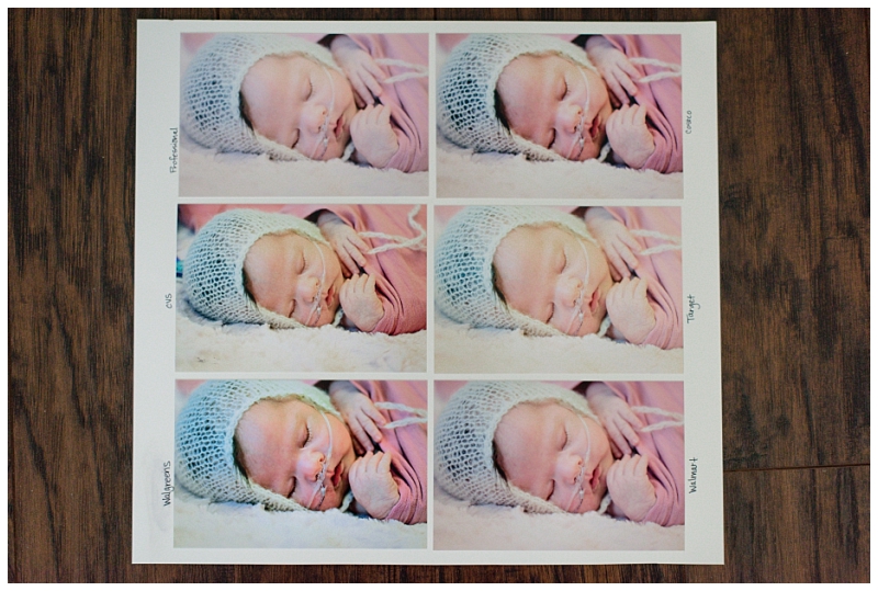
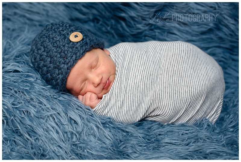
Last but not least is sweet little Mason. Again I picked this photo because of the blues. I thought it would be easy to tell the difference between the printers and it DOES!
Here are the comparisons.
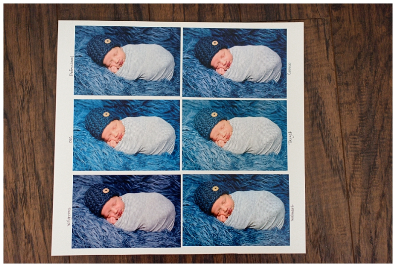
I am pretty sure that Target is trying to make my clients look like Oompa Loompas. They are all very yellow/orange. And once again Walmart and Costco are the closest but still far from the original.
Why did I spend all of this time showing you this? I don’t want to discourage you from printing your photos. On the contrary….I want you to print them. However, I want you to be educated. Not all photo printers are created equal. I think that for printing everyday photos, cheap and easy is fine. But when it comes to the professional family pictures you have done by a professional photographer…..they MUST be printed by a professional! You already spent the money on photos…..why would you not have the professional quality displayed instead of a cheap knock off.
Another thing you can’t see from the copy of the copy is the quality of the paper. The professional prints are heavier and just look and feel nicer. They have a beautiful matte finish and you can see and feel the difference. They are also coated with a UV coating that protects them from fading and from sun damage.
Do I print all of my personal photos from a professional lab? Nope. For scrapbooks, cards, calendars and things like that…I prefer to use Costco. I feel like they have the best quality. I also sometimes use Snapfish (especially when they have their penny print special). Now that I have printed all of these and now that my local Costco is no longer going to be printing photos I will probably use Walmart as I feel like their quality is similar to Costco (and honestly maybe even better….and cheaper). I would NEVER again use Target and my experience in the past (and also with these photos) is that Walgreens is a terrible bet as well. If you really need a good quality picture from past professional pictures (and your photographer doesn’t offer prints) then I would look into MpixPro. It is one step down from professional quality but it is still amazing (way better than any of these other ones printed locally). Their pricing is very affordable as well.
I hope this blog was educational and informative. It is my goal this year (and in all years going forward) that I provide professional quality prints for all of my LiLo families and friends. Not only do I provide service and prints but I want people to understand WHY!
I will do more Instagram stories today and I will show you with my phone the posters I made. Hopefully the phone will do a little bit better job showing the difference as opposed to my copy copies.
Also, if you are a LiLo client (or anyone who has digital photos just sitting on your computer) and you need HELP figuring out what to do with them, I am happy to meet with you to help you out. There is nothing more paralyzing than staring at 100+ photos (or years and years of digitals……you know who you are) trying to figure out what to do with them. Let this be your year to get those photos off of the computer and into your everyday life! Don’t be overwhelmed. Call LiLo! I want to help you!

")
")

[…] a print in a frame or on the wall, I highly recommend having them printed by a professional lab. Check out this (old) blog to see the details of why this is so important. Prints are not very expensive but they are a great […]